UX UI design trends 2025: what product teams should carry into 2026
See which 2025 UX and UI trends still drive user value, accessibility, and product performance in 2026—and learn how to prioritize them with confidence.
By Ajay Khatri ·
TL;DR
The strongest UX UI design trends 2025 produced were not isolated visual styles. AI-assisted workflows, multimodal interaction, accessibility-led decisions, purposeful feedback, and flexible design systems still matter because they can support useful product outcomes. We recommend assessing every trend against user value, brand fit, accessibility, technical cost, performance, and measurable impact before investing.
Table of Contents
- UX UI design trends 2025: what still matters in 2026?
- Use a product scorecard before following any design trend
- AI-assisted product design is not the same as AI-generated UI
- Natural, conversational, and multimodal interfaces move beyond chatbots
- Purposeful motion, microinteractions, and responsive feedback
- Distinctive visual systems without expensive decoration
- Accessibility and responsive behavior start with the first concept
- Design systems should enable experiments, not generic products
- How to evaluate UI UX design services for a trend-ready product
- FAQ
- Build around durable value, not temporary trends
UX UI design trends 2025: what still matters in 2026?
Many UX UI design trends 2025 looked impressive in curated galleries. Fewer held up against real content, responsive devices, accessibility needs, frontend constraints, and post-launch evaluation.
Looking back, 2025 was less about one defining aesthetic and more about AI-assisted work, natural interaction, distinctive visual systems, accessibility, and implementation discipline. In our view, the ideas worth carrying forward are those that make products clearer, more useful, and easier to trust.
We separate durable patterns from expensive decoration so teams can decide what to adopt, adapt, test, or reject. A product can look current while remaining confusing, inaccessible, slow, generic, or commercially ineffective.
The 2025 trends that carried forward
The most useful directions include:
- AI-assisted research, exploration, prototyping, and analysis
- Conversational and multimodal interaction linked to product context
- Accessibility-led hierarchy, interaction, and responsive behavior
- Purposeful microinteractions that communicate system status
- Flexible design systems with stable foundations and distinctive components
Each pattern can improve comprehension, efficiency, inclusion, or task completion when applied with care. More importantly, each gives teams a way to connect interface decisions to product outcomes rather than treating design as surface styling.
The patterns already showing fatigue
Indiscriminate glass effects, decorative 3D, excessive fluid typography, generic AI dashboards, and motion without feedback value can make supposedly futuristic products feel interchangeable.
Glassmorphism, immersive 3D, and fluid type are not automatically modern or useful. When they weaken contrast, delay loading, obscure hierarchy, or complicate implementation, they become expensive decoration.
Use a product scorecard before following any design trend
We recommend a six-part scorecard:
- User value: Does the pattern make an important task easier?
- Brand fit: Does it reinforce a recognizable identity?
- Accessibility: Can people perceive, understand, and operate it?
- Technical cost: Can the team build and maintain it reliably?
- Performance: Does it remain responsive on realistic devices?
- Measurable impact: Which product outcome should change?
Assess each factor before funding a polished prototype. Then test the weakest assumptions with users and engineers, using realistic content instead of idealized mockups.
A decision might connect to completion, errors, activation, conversion, retention, support demand, or perceived trust. Our end-to-end UI UX design service guide explains how product outcomes can inform the workflow from the initial goal through production.
Six questions to ask before adopting a trend
Ask whether the idea:
- Solves a real problem rather than making a mockup more impressive
- Expresses the brand instead of copying a familiar visual recipe
- Remains readable, operable, and understandable
- Works across realistic devices and content lengths
- Can be maintained without disproportionate effort
- Produces an outcome the team can evaluate after release
For example, assess glassmorphism against readability, contrast, performance, implementation effort, brand relevance, and task completion. Visual novelty should not outweigh serious weaknesses elsewhere.
Adopt, adapt, test, or reject
Adopt patterns with clear user value and manageable risk. Adapt promising ideas to the product’s context rather than copying their original form.
Test uncertain concepts with realistic data, edge cases, devices, and users. Reject decoration that cannot justify its effects on accessibility, maintenance, performance, or comprehension.
AI-assisted product design is not the same as AI-generated UI
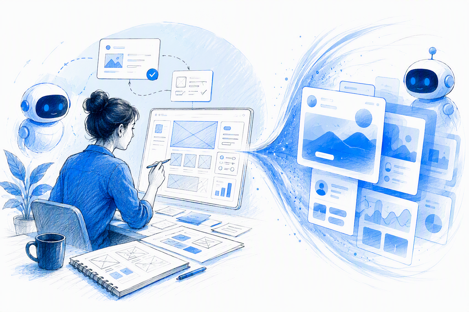
AI can accelerate exploration, content variants, wireframes, interface drafts, prototypes, and analysis. It cannot decide which problem deserves attention or whether a generated workflow is safe, coherent, and useful.
Our view is simple: AI does not remove the need for product judgment. It can make weak decisions easier to reproduce at scale. An AI-generated dashboard may assemble screens quickly, but a useful product still requires people to validate needs, structure information, examine edge cases, and test interactions.
For a deeper framework, our guide to AI-driven user experiences users can trust examines the relationship between automation, control, and confidence.
Where human judgment must stay in the loop
Designers still need to:
- Check whether research inputs represent relevant users
- Decide what belongs in the flow and what remains under user control
- Identify where suggestions need explanations or confirmation
- Design information architecture and interaction logic
- Review safety, accessibility, privacy, and failure states
- Validate concepts against technical constraints
Generated summaries are not evidence by default. Generated screens are not validated experiences.
Why unfinished AI features can destroy trust
Releasing an unreliable AI feature transfers some product risk to the user. A poor recommendation could waste time, expose information, trigger an unwanted action, or reduce confidence in the wider product.
We recommend bounded releases, visible uncertainty, reversible actions, confirmation for consequential steps, and access to human support where appropriate. Teams should examine correction, repeated prompting, abandonment, and override behaviour rather than relying on clicks alone.
Analytics can show what people selected while missing hesitation, distrust, or confusion. Qualitative research helps explain why a flow succeeds or fails.
Natural, conversational, and multimodal interfaces move beyond chatbots
Natural interaction is moving beyond chatbots added to otherwise unchanged products. Interfaces can combine text, voice, images, gestures, graphical controls, and system suggestions according to the task.
Someone might upload an image, refine a request through conversation, review a structured result, and confirm it before any action occurs. That can be more useful than forcing the entire workflow through an empty chat box.
Graphical interfaces can also reduce reliance on lengthy instructions through recognizable controls and direct manipulation. They still need clear labels, guidance, keyboard support, and accessible alternatives.
Choose the right input for the task
Use conversation for ambiguous requests, direct manipulation for spatial tasks, and structured controls when precision or auditability matters.
Consider:
- The user’s environment and abilities
- Privacy expectations
- Input complexity
- Required precision
- Consequences of an error
- Whether the result must be reviewed later
Combine modalities only when each removes friction. Voice, image, and gesture should not be added merely to signal innovation.
Design personalization with restraint
Personalization can become surveillance dressed as convenience. Adapting layouts, content, or notifications based on behaviour may improve relevance, but incorrect assumptions can feel invasive or remove control.
Ask permission where needed, minimize collected data, explain consequential adaptations, and provide straightforward controls. Evaluate relevance alongside errors, discomfort, overrides, and trust.
Purposeful motion, microinteractions, and responsive feedback
Motion should communicate state, hierarchy, progress, causality, continuity, or feedback. It is a communication layer, not an ornamental transition between every screen.
Useful applications include:
- Loading and system status
- Form validation
- Drag-and-drop states
- Optimistic updates
- Completion and confirmation
- Undo actions
- Error recovery
A checkout microinteraction can show validation, loading, success, and recovery without delaying completion. Elaborate transitions that interrupt the task add cost without necessarily improving understanding.
What a microinteraction should communicate
A microinteraction should show what changed, why it changed, whether the system is working, and what can happen next. Timing and emphasis should match the importance of the event.
Reduced-motion preferences and non-motion alternatives belong in the initial concept. Text, icons, colour, and persistent state changes should communicate the same essential information.
Measure motion instead of admiring it
Test whether motion reduces errors, improves orientation, or makes feedback easier to understand. Do not judge it only by how polished it looks in a portfolio clip.
Remove animations that delay action, cause discomfort, consume unnecessary resources, or add no meaningful feedback. Useful motion earns its place.
Distinctive visual systems without expensive decoration
Expressive typography, controlled depth, spatial composition, selective 3D, and brand-specific components can create a recognizable identity. The goal is recognition and comprehension, not maximum visual novelty.
Visual hierarchy and product meaning matter most in data-heavy or task-critical interfaces. UI and web design should also be assessed separately from adjacent fields such as logo design, where different constraints apply.
When glass, depth, and 3D earn their place
Glass effects can clarify layering or focus. Depth and 3D can explain spatial relationships, product objects, or direct manipulation.
Before approval, test:
- Text contrast and input states
- Lower-powered devices
- Loading behaviour
- Fallback rendering
- Responsive layouts
- Development and maintenance cost
If a translucent panel makes content harder to read, it has failed regardless of its visual appeal. The benefit must justify the implementation, maintenance, and performance costs.
How to create a recognizable interface
Build identity through typography, content rhythm, imagery, motion, interaction language, and a focused set of signature components. Keep reusable foundations elsewhere.
Not every screen needs to be unconventional. Concentrate distinction where it improves recognition, comprehension, or conversion. Our perspective on graphic design for distinctive, build-ready digital products explores how we balance identity with implementation.
Accessibility and responsive behavior start with the first concept
Accessible UI design shapes structure, content, colour, typography, motion, focus order, targets, and interaction from the beginning. Treating accessibility as a final audit makes fundamental decisions harder to reverse.
Responsive UX should follow task priority and content relationships rather than simply shrinking a desktop composition. Keyboard access, screen-reader semantics, zoom, contrast, reduced motion, error recovery, and touch ergonomics belong in prototypes and acceptance criteria.
Inclusive constraints can lead to clearer interfaces for a wider range of people.
Prototype real constraints early
Prototype with:
- Realistic content lengths and localization
- Validation errors and recovery paths
- Empty, loading, and failure states
- Slow connections
- Narrow screens and large text
- Keyboard navigation
- Reduced motion
- Assistive-technology paths
Testing these conditions early can expose structural weaknesses before the visual direction becomes costly to change.
Make accessibility part of shipped fidelity
Component specifications should include accessible states, semantics, keyboard behaviour, focus treatment, and error handling. Leaving those decisions open to interpretation creates inconsistent implementation.
Validate the build as well as the design file. An accessible concept can still become an inaccessible product during development, which is why connecting UX/UI design to frontend reality matters.
Design systems should enable experiments, not generic products
Maximum consistency does not automatically create better UX. A rigid component library can suppress useful experiments and encourage products assembled from familiar patterns.
We use stable foundations for accessibility and common behaviour while allowing flexibility for product-specific workflows and brand expression. Governance should explain how teams propose, test, document, evaluate, and retire variants.
Standardize foundations, not every expression
Standardize:
- Design tokens
- Accessibility behaviour
- Form logic
- Feedback states
- Repeatable interaction rules
- Core responsive behaviour
Allow deliberate variation in high-value workflows, editorial layouts, data storytelling, and signature moments. Custom components should appear where identity or comprehension benefits most.
Prevent the component library from becoming the product strategy
Start with the user’s task and the information model. Only then decide whether an existing component fits.
Track exceptions and experiments so useful patterns can evolve into the system. A design system should support learning rather than block an appropriate solution because it is absent from the current library.
How to evaluate UI UX design services for a trend-ready product
Teams comparing UI UX design services should look beyond polished screens. A strong portfolio should reveal problem framing, research logic, interaction rationale, responsive states, accessibility decisions, implementation evidence, and relevant outcomes.
Designers with UX, UI, and frontend fluency can test feasibility earlier and reduce handoff problems. Our guide to UI/UX designing services that go beyond pretty screens explains why deliverables alone are not enough.
Evidence to request from UI and UX design services
Ask:
- How did user evidence and business goals shape decisions?
- Which concepts were rejected, and why?
- Does the portfolio compare concepts with shipped products?
- Are responsive states and edge cases visible?
- What changed after technical validation?
- Which outcomes were evaluated after launch?
A practical buyer’s guide to build-ready product design can help teams distinguish strategic services from screen-production packages.
Why UX, UI, and frontend fluency belong together
Early technical validation can uncover performance, responsiveness, accessibility, and component constraints before they weaken the finished product. A shared perspective across strategy, interface craft, and execution also reduces translation loss between concept and production.
At amajaying.com, we combine UX thinking, distinctive UI craft, and frontend awareness. We help teams select and ship ideas that serve both users and the business instead of chasing every new style.
FAQ
Which UX UI design trends 2025 remain relevant in 2026?
We see lasting value in AI-assisted workflows, multimodal interaction, accessibility-led design, purposeful microinteractions, responsive behaviour, and flexible design systems. Decorative treatments remain useful only when they support hierarchy, product meaning, brand identity, or a clear task outcome.
Is AI-generated UI enough to design a complete product?
No. AI can accelerate drafts and variations, but teams must still validate user needs, information architecture, safety, accessibility, edge cases, and commercial priorities. Human judgment is also needed wherever people require control, explanation, or confirmation.
How should teams evaluate glassmorphism?
Assess it against user value, brand fit, accessibility, technical cost, performance, and measurable impact. Test contrast, input states, responsive layouts, fallback rendering, and realistic devices. Keep it only if its contribution to hierarchy, focus, or identity justifies the cost.
What should buyers expect from UI and UX design services?
Buyers should expect more than interface files. Strong services connect user evidence and business goals to design decisions, document responsive and accessible behaviour, validate technical feasibility, and consider implementation fidelity. They should also define how the product will be evaluated after launch.
Can a design system make a product feel generic?
Yes. A rigid system can turn consistency into sameness when teams choose components before understanding the task. Strong systems standardize foundations while allowing deliberate variation in product-specific workflows and high-value brand moments.
Build around durable value, not temporary trends
Ready to create a distinctive product that can survive production reality? Explore our UI/UX design services connecting product thinking, interface craft, and frontend execution and work with us to turn the right ideas into a build-ready experience.