Product design examples of portfolio work that prove real product skill
Explore product design portfolio examples that reveal ownership, decision quality, shipped execution, and measurable outcomes. Build a stronger portfolio today.
By Ajay Khatri ·
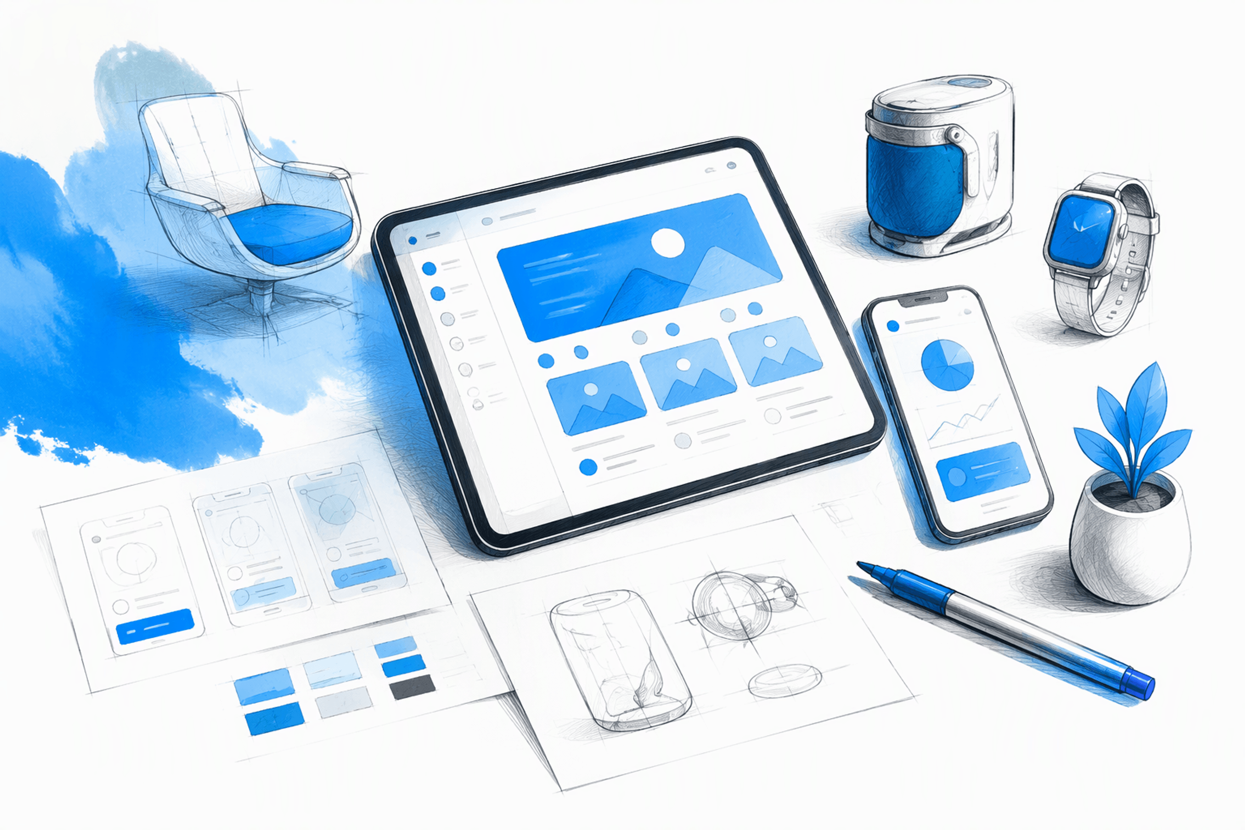
TL;DR
People searching for product design examples of portfolio work usually need more than visual inspiration. The strongest portfolios quickly show the problem, the designer’s ownership, the reasoning behind key decisions, the quality of the final execution, and the outcome. We recommend a focused website with a small set of relevant case studies, supported by a concise PDF when useful. Polish matters, but polish without evidence is decoration.
Table of contents
- Product design portfolio examples: What the best ones prove
- The 30-second, two-minute, and full case-study test
- A strong product design case study structure
- How to make individual ownership unmistakable
- Hevo Blog UI: From content diagnosis to shipped interface
- How to show impact when metrics are confidential or unavailable
- Custom site, no-code builder, PDF, or hosted case study?
- Portfolio quality is product quality
- FAQ
- Build a portfolio and product experience that earns confidence
Product design portfolio examples: What the best ones prove
Many product design portfolios look impressive until we ask four questions: What was the problem? What did the designer own? What shipped? What changed?
A persuasive portfolio answers those questions without forcing reviewers through a cinematic introduction or a long process diary. We assess portfolios through five signals:
- Problem complexity: Was the challenge meaningful, constrained, and relevant?
- Individual ownership: What did the designer personally own, influence, or execute?
- Decision quality: Were choices supported by evidence and clear trade-offs?
- Shipped execution: Did the thinking carry through to refined UI and implementation?
- Outcomes: What changed, and what evidence supports that conclusion?
This approach is more useful than an unranked gallery of attractive screens. We generally recommend a small selection of detailed projects aligned with the work being pursued, rather than a large collection included only to suggest range.
For a faster evaluation model, see our guide to product design portfolio examples that pass the 30-second hiring scan.
What is a product portfolio example?
A product portfolio example shows how a designer moved from a product problem to a shipped or implementation-ready experience. It connects context, constraints, reasoning, interaction design, interface craft, collaboration, and results.
Final UI can demonstrate taste and execution quality, but it cannot independently prove product design ability. A polished dashboard does not reveal whether the designer identified the right problem, handled technical constraints, tested alternatives, or influenced what reached users.
Product design versus graphic and industrial design portfolios
Graphic design portfolios often prioritise visual communication, typography, identity, concept development, and campaign craft. Industrial design portfolios may emphasise physical form, materials, ergonomics, prototyping, manufacturing, and production feasibility.
These disciplines overlap with digital product design, but their evidence is not interchangeable. Product design portfolios should reveal interaction logic, user journeys, system behaviour, cross-functional collaboration, implementation decisions, and outcomes—not just visual composition.
The 30-second, two-minute, and full case-study test
Hiring teams may not evaluate every portfolio from beginning to end. Strong portfolios therefore use progressive disclosure: immediate orientation, scannable project evidence, and deeper case studies for closer review.
This hierarchy supports both quick screening and thoughtful evaluation. Visible project summaries are more useful than introductions built around oversized statements, autoplay media, or decorative interactions.
Our practical review of a product design portfolio sample applies this layered approach to the evidence hiring teams need.
What should be clear within 30 seconds
A reviewer should quickly understand:
- The designer’s identity and discipline
- Location, availability, or working model
- The strongest projects
- Role and seniority positioning
- Overall level of UI craft
- Contact or next-step information
For a hybrid designer, the value proposition should connect UX reasoning, refined UI, and frontend execution. “Product designer creating clear digital experiences from problem framing through implementation” is more informative than a broad claim about making meaningful products.
What should be clear within two minutes
Each project card should communicate the problem, product context, personal role, one pivotal decision, the result, and a direct case-study link. That gives reviewers enough information to decide where to focus.
The portfolio should also establish relevance. A team hiring for complex SaaS workflows needs different evidence from a founder commissioning a content-led marketing experience.
What a full case-study read should reveal
The complete story should explain why decisions were made, which alternatives were rejected, where collaboration changed the direction, and what happened after delivery. It should demonstrate judgment rather than simply prove that familiar design activities occurred.
We rarely need every workshop, sticky note, and wireframe arranged as a chronological process trail. A curated sequence—context, constraint, options, chosen direction, final experience, and evidence—usually communicates more.
A strong product design case study structure
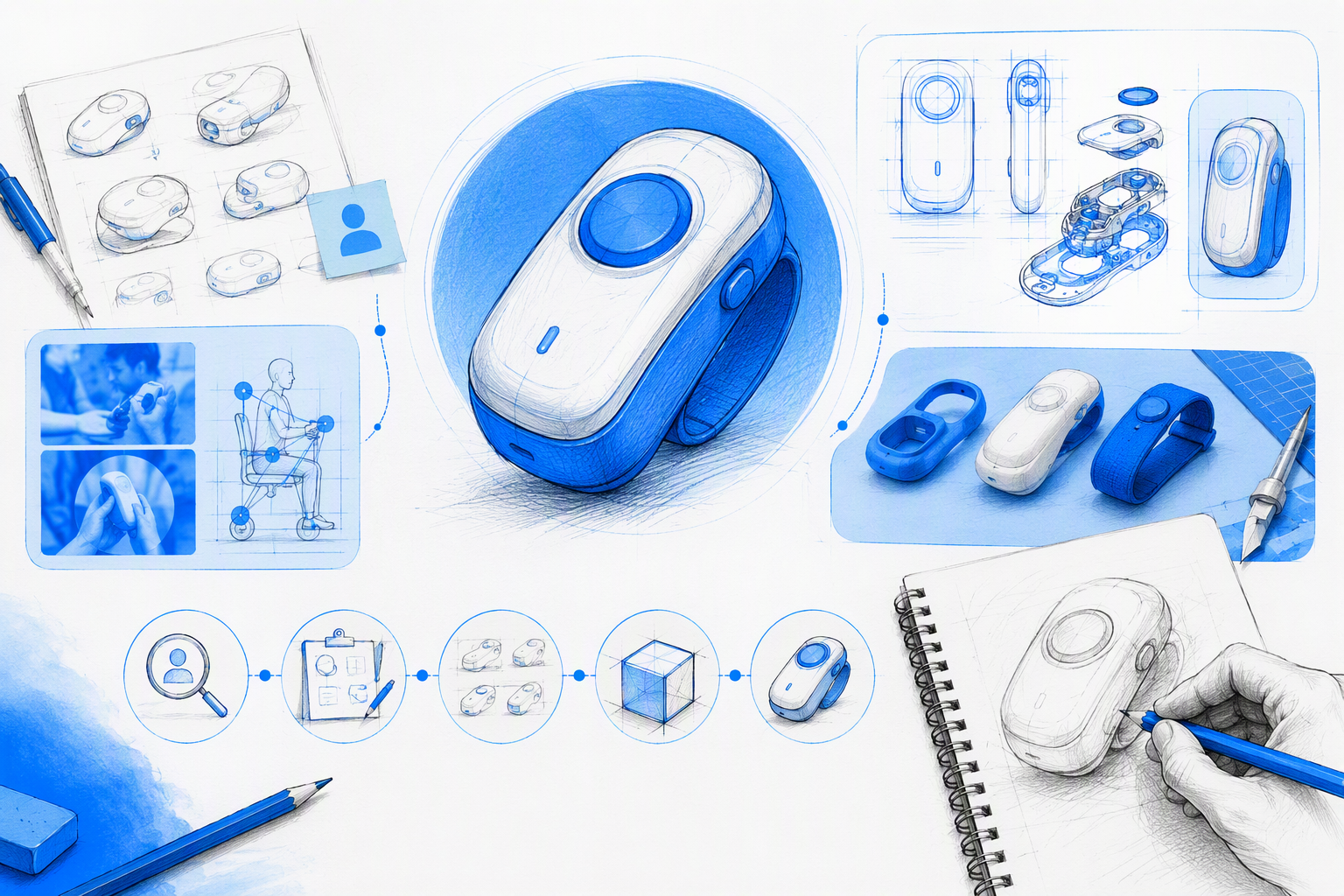
We recommend using this structure:
- Context and product background
- Problem or opportunity
- Constraints
- Personal role and team
- Relevant process evidence
- Pivotal decisions and trade-offs
- Shipped or final experience
- Outcomes and limitations
Balance matters. UX reasoning establishes rigour, while resolved UI shows that the solution was carried through with care. Concise summaries, annotated visuals, useful captions, and clear transitions connect the two.
Our guide to building product design case studies hiring teams trust explains how to turn project material into credible evidence rather than an exhaustive archive.
Show constraints and trade-offs
Credible case studies disclose relevant technical, commercial, timeline, content, data, and organisational limitations where permission allows. These constraints explain why the final solution looks and behaves as it does.
State what was deprioritised and why. A polished result becomes more believable when reviewers can see the compromises, dependencies, and rejected directions behind it.
Curate UX artefacts instead of creating a process dump
Include research, flows, sketches, prototypes, or usability findings only when they explain a consequential decision. Every artefact should answer a question about the solution.
Replace walls of sticky notes and generic methodology diagrams with annotated evidence. A single flow explaining how a confusing path was simplified may reveal more judgment than a collection of workshop photographs.
Connect final UI to the original problem
Interface captions should explain which user or business issue each decision addresses. Instead of writing “new article card,” explain that the card creates a clearer category signal and makes content-heavy pages easier to scan.
Show important states, responsive layouts, realistic content, and implementation conditions. Consistency between UX intent, visual design, and delivered behaviour is a strong execution signal.
How to make individual ownership unmistakable
Repeatedly saying “we” may reflect healthy collaboration, but it can make individual capability difficult to assess. Reviewers need to understand exactly what the designer contributed.
We recommend separating contributions into four categories:
- Owned: Work and decisions for which the designer was directly accountable
- Influenced: Strategy or direction shaped without sole authority
- Collaborated on: Shared work completed with named partners
- Supported through shipping: QA, specifications, frontend work, or launch support
Each case study should state team composition, scope, timeframe, and decision authority near the beginning. This gives colleagues appropriate credit while keeping personal contribution precise.
Use specific ownership language
Replace “We redesigned the experience” with wording such as: “I owned the information architecture and interface system, partnered with the content team on taxonomy, and supported implementation through design QA.”
Specific verbs reveal whether the designer conducted research, mapped flows, defined interaction patterns, created prototypes, tested concepts, built components, wrote frontend code, or guided delivery. They also distinguish strategic influence from hands-on execution.
Show collaboration without hiding behind it
Name relevant partners, such as product managers, engineers, researchers, marketers, content strategists, data teams, or founders. Explain how dependencies, feedback, and disagreements affected the result.
A useful case study identifies which deliverables and decisions belonged to the designer, then shows where collaboration strengthened them. Our guide to spotting genuinely hireable product designer portfolio examples provides further criteria for separating participation from ownership.
Hevo Blog UI: From content diagnosis to shipped interface
The Hevo Blog UI offers a useful case-study model because the story can connect a content challenge to information hierarchy, reusable interface decisions, responsive behaviour, and delivery. The work should appear as a connected product narrative rather than a gallery of isolated screens.
The case study can begin with how readers encounter and scan a content-rich product. From there, it can move through structural diagnosis, UI decisions, implementation considerations, and the final experience.
Diagnosis and information hierarchy
The central design question should not be limited to making the blog more attractive. A stronger framing asks how hierarchy can help readers discover, prioritise, and move through relevant content with less friction.
That approach directs attention to category signals, article relationships, page structure, and reading journeys. Structural changes can then be connected to specific content needs rather than subjective visual preference.
UI craft and execution
Typography, spacing, hierarchy, content modules, and reusable patterns should work together to make dense content easier to scan. Responsive behaviour matters too, because the hierarchy must remain intelligible when navigation, cards, and article layouts compress.
The ownership statement should specify who handled the information architecture, UI system, taxonomy, handoff, and quality review. Clear attribution establishes accountability while recognising collaboration.
At amajaying.com, we treat implementation awareness as part of design quality. Components, states, realistic content, and responsive rules help reduce the gap between a polished mockup and the experience that ships.
Impact and evidence
No unsupported quantitative result should be attached to a project. When verified metrics are confidential or unavailable, a case study can report approved stakeholder feedback, validated usability evidence, shipped scope, implementation fidelity, or the adoption of reusable patterns.
Keep intention and evidence separate. “Designed to improve discovery” describes a goal. A claim that users found content more successfully requires documented testing or product data.
How to show impact when metrics are confidential or unavailable
“Impact-driven” is a positioning statement, not evidence. A strong portfolio names what changed and how the designer knows.
We use this evidence ladder, beginning with the strongest proof available:
- Business outcomes
- Behavioural product metrics
- Task-performance or usability results
- Operational improvements
- Feature or system adoption
- Stakeholder and user evidence
- Verified shipped scope
A credible impact statement identifies the original problem, intervention, observed change, evidence source, and disclosure limits. It does not invent percentages, participants, research findings, or causation.
Credible alternatives to revenue and conversion data
Depending on the project, verified alternatives may include a shorter flow, lower support demand, faster internal work, improved task completion, better content discovery, accessibility improvements, or adoption of a design system.
Separate results from expectations. A statement that a revised flow contains fewer steps describes a structural change. Claiming that it increased conversion requires actual measurement.
Handle confidential work responsibly
Contracts, legal guidance, and client approval come first. Restricted information should never be exposed simply to make a portfolio look stronger.
Where permission allows, use anonymised context, redacted narratives, approved screenshots, ranges, or process-level evidence. Password protection can support confidentiality requirements, while an approved public summary gives reviewers enough context to decide whether to request access.
Custom site, no-code builder, PDF, or hosted case study?
Format affects review speed, narrative depth, maintenance, portability, and creative control. The best option is not necessarily the most complex. It is the one that presents evidence clearly and reliably.
For designers positioning UX, UI, and frontend as a connected capability, we recommend a focused custom portfolio hub. A PDF works well as a supporting leave-behind or presentation aid rather than the main discoverable experience.
Portfolio format scorecard
| Format | Cost and effort | Build speed | Narrative depth | Maintenance | Portability | Creative control |
|---|---|---|---|---|---|---|
| Custom site | Higher | Slower | Excellent | More involved | Strong | Excellent |
| No-code builder | Moderate | Fast | Strong | Manageable | Strong | Moderate to strong |
| PDF deck | Low to moderate | Fast | Strong when presented | Manual | Excellent | Strong but static |
| Hosted case study | Low | Fastest | Moderate | Easy | Strong | Limited |
Templates are not inherently weak. Problems arise when generic hierarchy, default interactions, placeholder-style copy, and an unchanged visual system make the portfolio feel impersonal.
When prototypes, motion, and frontend execution add value
Interaction earns its place when it demonstrates behaviour, removes ambiguity, or proves implementation capability. A working responsive pattern can strengthen a case study. Decorative transitions that delay access to evidence cannot.
Live work and implementation details are useful when they are stable, accessible, and relevant to the designer’s role. Teams assessing delivery capability can also use our guide on how to find a product designer who can actually ship.
Portfolio quality is product quality
A portfolio is itself a product experience. Mobile performance, accessible contrast, keyboard support, readable typography, coherent navigation, and restrained animation all reveal design judgment.
Broken links, slow media, unclear labels, and inconsistent responsive behaviour undermine claims of execution quality. A hybrid designer’s site should demonstrate continuity from information architecture through visual polish and frontend finish.
The essential portfolio quality checklist
Before publishing, verify:
- Fast initial loading and compressed media
- Descriptive project titles
- Visible, consistent navigation
- Clear calls to action and contact details
- Responsive layouts across practical breakpoints
- Useful alternative text
- Semantic page structure
- Legible typography and contrast
- Visible keyboard focus states
- Respect for reduced-motion preferences
- Working links and current project information
These are not optional finishing touches. They are part of the evidence.
Why more projects can reduce credibility
Every weak or irrelevant project can lower the perceived standard of the strongest work. Quantity does not automatically communicate range.
We recommend selecting a small group of projects that collectively demonstrate depth, versatility, and relevance. Difficult problems, precise ownership, refined execution, and credible outcomes matter more than a large but uneven gallery.
FAQ
What is the best website for a design portfolio?
The best website makes the designer’s role, decisions, shipped work, and outcomes easy to evaluate. For hybrid UX, UI, and frontend positioning, we favour a focused custom hub with strong performance and clear case-study navigation. A carefully customised no-code site can also work well.
How do you create strong portfolio examples?
Choose projects relevant to the intended audience, then document the problem, constraints, personal ownership, pivotal decisions, final work, and evidence of impact. Include only the process material that explains meaningful choices. Concise summaries and annotated visuals help reviewers scan before reading the full case study.
What should an entry-level designer include?
Entry-level portfolios can feature internships, community work, constrained self-directed projects, or thoughtful critiques of existing products. Honest labelling is essential. Separate observed problems from assumptions, and never invent research participants, client relationships, launches, or metrics.
What is a portfolio for a graphic designer?
A graphic design portfolio is a curated presentation of visual communication work, often highlighting typography, identity, composition, campaigns, and concept development. A product design portfolio needs additional evidence, including product reasoning, user flows, interaction decisions, constraints, collaboration, execution, and outcomes.
Should a portfolio be a website or PDF?
We recommend using a website as the primary discoverable portfolio and a concise PDF as an optional, role-specific leave-behind. The website supports responsive reading, live interaction, navigation, and updates. A PDF is useful for presentations, direct sharing, and controlled narratives.
Build a portfolio and product experience that earns confidence
Need a designer who can connect UX thinking, distinctive UI, and frontend-aware execution? Explore our product design work and start a conversation about the experience your team needs to ship.